Al KHALIFA
Logo

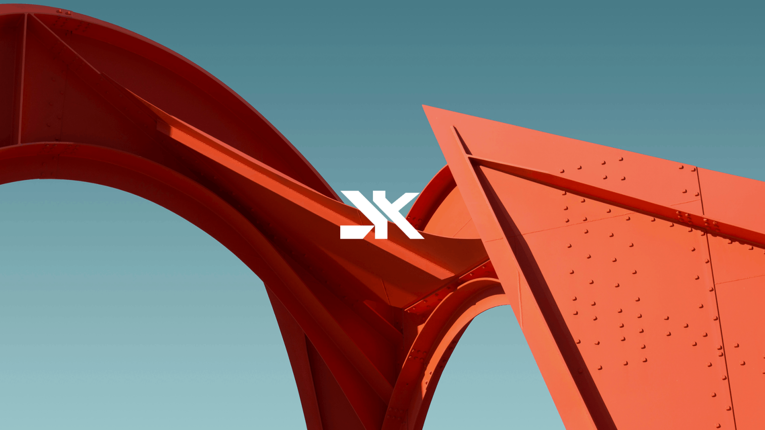
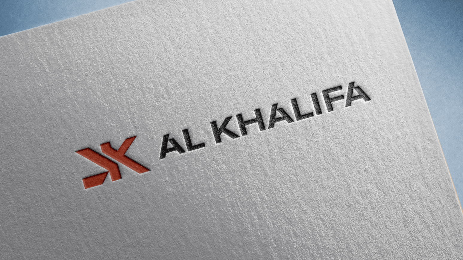
The Al Khalifa logo was developed with a focus on reliability, scale, and a modern approach to construction. The visual concept is based on a clean symbol and strict typography, creating the image of a strong and confident company.
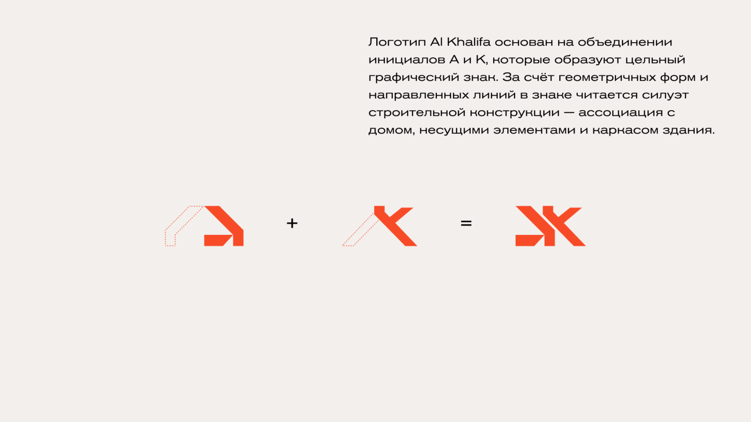
The graphic symbol is designed as a stylized monogram built from clear geometric shapes. It is associated with structural elements, stability, and architectural precision — key values of the construction industry. Sharp lines and angular forms emphasize the company’s technological expertise and high level of professionalism.
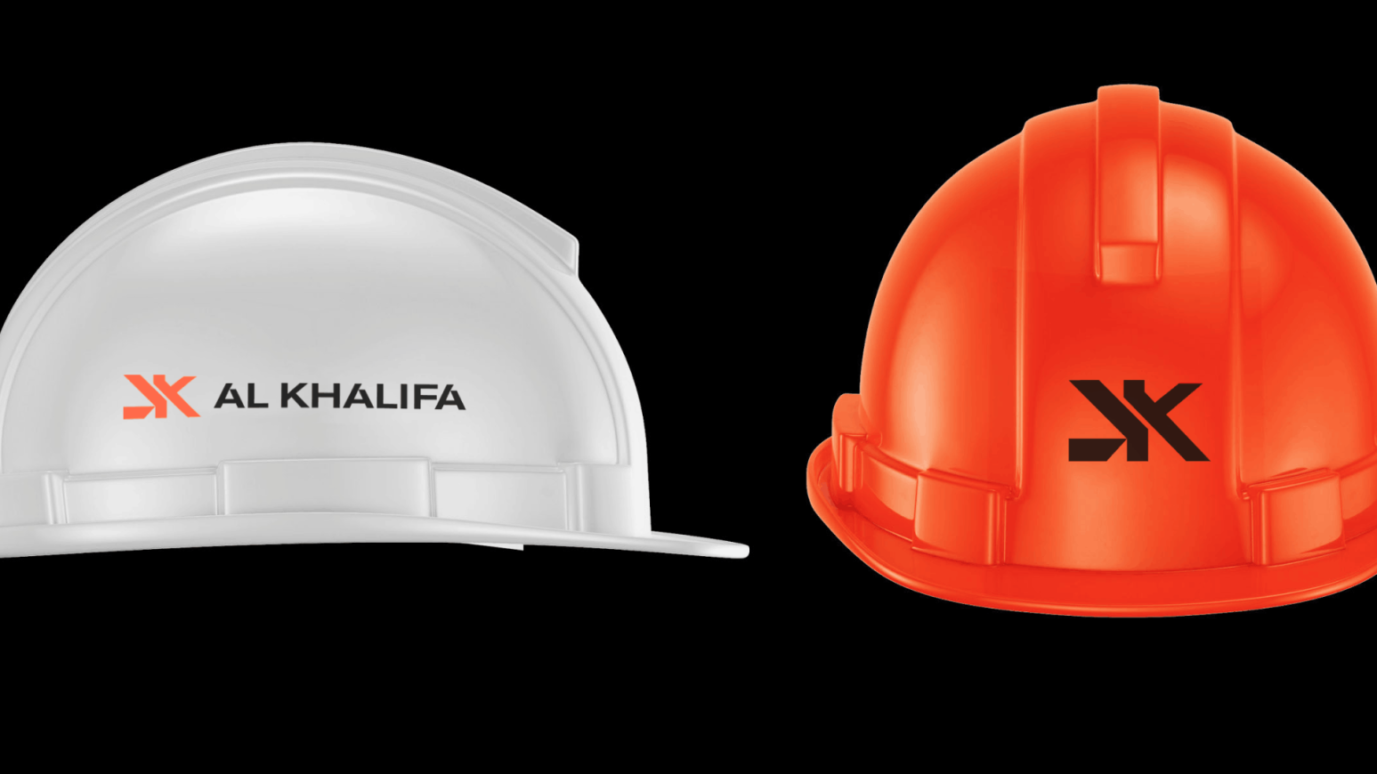
The color palette is based on the contrast between a bold accent color and a neutral dark tone. The accent color represents energy, growth, and ambition, while the dark typography conveys stability and trust. This combination makes the logo eye-catching while remaining restrained and premium in appearance.


2017 - 2026 © KIRANO